Good artwork for screen printing is the fastest way to a clean print and a fair price. Every color in your design becomes its own screen, so the file you send decides how sharp the edges look, how many screens we burn and how long prep takes. So this guide covers what we ask for, why, and the mistakes we see most often at our Orlando studio.
Why screen printing is picky about files
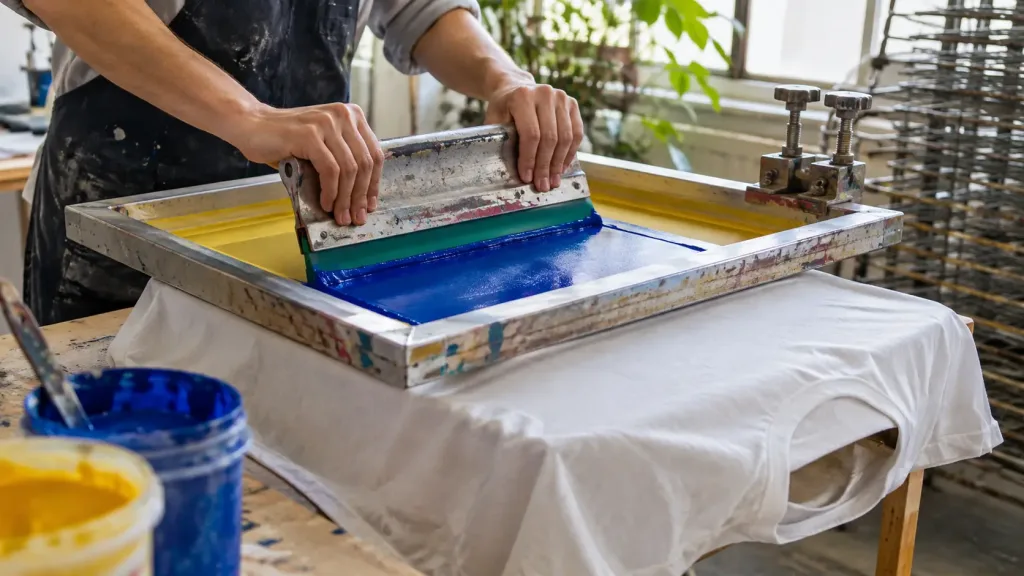
A screen is a stencil. To make one, we print each color of your design as solid black on clear film, then expose it onto a coated mesh. Anything soft, blurry or semi-transparent in the file has to become a hard yes or no: ink here, no ink there.
That is why a design that looks fine on a phone can still print poorly. The screen does not care how it looks on screen. Instead, it cares how cleanly each color separates.
The best file formats for artwork for screen printing
| Format | Type | How it prints |
|---|---|---|
| AI, EPS, PDF (with live vectors) | Vector | Best. Sharp at any size, easy to separate |
| SVG | Vector | Very good, as long as text is outlined |
| PSD with layers | Raster | Good at full size and 300 dpi |
| PNG with transparency | Raster | Good at 300 dpi at the printed size |
| JPG | Raster | Usable if large; no transparency, often needs cleanup |
| A screenshot or social media image | Raster | Usually too small; needs redrawing |
Vector or raster?
Vector graphics are built from paths, not pixels. So they stay perfectly sharp whether we print them 3 inches wide or 13. For that reason, logos, type and line art should almost always be vector.
Raster images, on the other hand, are grids of pixels. They work for screen printing when they are big enough. Our rule of thumb is 300 dpi at the size it will be printed. For example, a 12-inch-wide chest print needs about 3,600 pixels across.
Five things to check before you send a file
1. Size it to the print
Tell us how big you want the print, or let us suggest it. A standard adult chest print is often around 10 to 12 inches wide. A left-chest logo, however, is closer to 3 or 4. If your file is tiny, enlarging it will not add detail; it only adds blur.
2. Turn text into outlines
If your design has type, convert it to outlines (or send the font). Otherwise our software may swap in a different font, and your design changes without anyone noticing until the proof.
3. Count and name your colors
Every color is a screen. So list the colors you want, ideally with Pantone references if you have them. If you do not, a hex code or a photo of the color you like works too. Then we mix ink to match and check it under daylight.
4. Watch out for fake transparency
Soft shadows, glows and fades look nice on a monitor, but screens see them differently. On a screen, though, they must become halftones, small dots that trick the eye. They can look great, but they need care and a finer mesh. Flag them and we will plan for it.
5. Mind the thinnest lines
Very thin lines and tiny text can fill in or break up, especially on fleece and textured fabric. As a guide, keep lines at least about 1 point thick at the final size. Also, we will warn you if anything looks too fine.
Common artwork mistakes we fix every week
- A white box around the design. If the background is white, it may print as a white rectangle. Send it transparent or tell us to drop it.
- Too many near-identical colors. Three slightly different blues also mean three screens. Merge them and save money.
- Logos pulled from a website. They are usually 300 pixels wide, so ask your designer for the original file.
- Photos with no plan. Photos can be printed, but they need separations. Ask first.
- Art you do not own. We can only print artwork you have the right to use. That also includes characters and brand logos.
What happens after you send artwork for screen printing
First, we check the file and tell you if anything will not print cleanly. Next, we separate it into one film per color. Then we send a proof: a mockup on the garment showing size, placement and ink colors. Nothing is printed until you approve it. The whole sequence is in our guide to the screen printing process.
Designing with screens in mind
The best artwork for screen printing is designed for the medium from the start. In short, bold shapes, a limited palette and clear contrast print beautifully and cost less. If you are drawing something new, read why fewer colors make better prints before you start.
Not a designer? That is fine. Send what you have, even a sketch on paper, and describe what you want. Then we will tell you honestly what it takes to make it print-ready.
Where to place the print
Placement is part of the artwork, so decide it before you send files. Common locations each have a usual size range:
| Location | Typical width | Good for |
|---|---|---|
| Full front | 10 to 12 inches | Main graphics, band art |
| Left chest | 3 to 4 inches | Logos, staff shirts |
| Full back | 12 to 14 inches | Tour dates, big illustrations |
| Upper back, below the collar | 3 to 10 inches | Small marks, website or name |
| Sleeve | 2 to 3 inches | Small details |
Each location is a separate setup, so two locations cost more than one. If you are unsure, tell us the feel you want and we will suggest a size on the proof.
Artwork for screen printing on dark garments
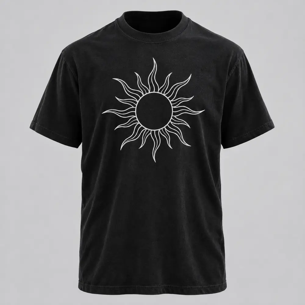
Dark shirts change how you should think about artwork for screen printing. Bright colors on black need a white underbase, which we create from your design during separation. So you do not need to draw it, but you should know it exists. Also, very thin colored lines on a dark shirt can lose brightness, because the underbase under them is thin too. Bold shapes stay brighter.
If you want a soft, light print on a dark cotton shirt instead, ask about discharge. In fact, it needs no underbase at all. See specialty screen printing for how it works.
Ready to send it?
Upload your file through our custom run form. It accepts AI, PDF, SVG, PNG and JPG up to 20 MB. Add the garment, the quantity and when you need it, and we will reply with a proof and a price. Curious about the numbers first? See how much screen printing costs.
Artwork questions we hear
What file format is best for screen printing?
Vector files such as AI, EPS, PDF with live vectors, or SVG with outlined text print the cleanest. High resolution PNG files at 300 dpi at the printed size also work well.
What resolution do I need?
Aim for 300 dpi at the size the design will be printed. For a 12 inch wide print, that is about 3,600 pixels across.
Can you fix a low resolution logo?
Often yes, by redrawing it as a vector, but that adds design time and cost. It is usually faster to ask your designer for the original file.
Do I need Pantone colors?
No. Pantone references are ideal, but a hex code or a photo of the color you want works too. We mix ink to match and check it under daylight.