Screen printing colors work differently from colors on a screen. Each one needs its own stencil, its own ink and its own pass on every shirt, so the number of colors in a design shapes how it looks, how long it takes and what it costs. After years of pulling prints, we have learned that fewer colors usually make a better print. So here is why, and how to design that way without losing anything.
How screen printing colors add up
On a computer, adding a color is free. On a press, it is not. Every color in your design becomes:
- A film separated from your artwork.
- A screen coated, burned and registered on the press.
- A batch of ink mixed and matched by hand.
- A pull on every shirt, sometimes with a flash between layers.
So a five-color design is roughly five times the setup of a one-color design, and every shirt goes under the squeegee five times. That is why color count moves price more than almost anything else, as we explain in how much screen printing costs.
Why fewer colors often look better
Stronger graphics
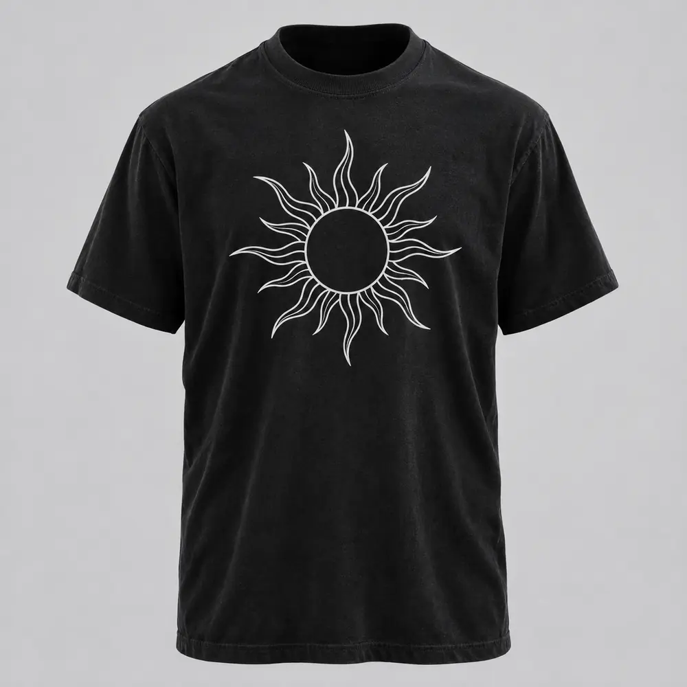
Limits push design in a good direction. With two or three inks, you have to decide what matters, so that clarity reads from across a room. That is also why so many classic band shirts and gig posters use only one or two colors.
Cleaner registration
Every extra screen is another chance for colors to sit a hair out of line. So with fewer screens, edges stay crisp and the print looks sharper. Registration is careful work on any job, but it is easier to get perfect with three screens than with eight.
A softer, lighter print
Stacked layers of ink add thickness. A design built from few colors, each printed once, feels lighter on the shirt and moves with it. This matters most on light fabric and with plastisol, as covered in water-based vs plastisol ink.
Tricks to get more from fewer screen printing colors
Let the shirt be a color
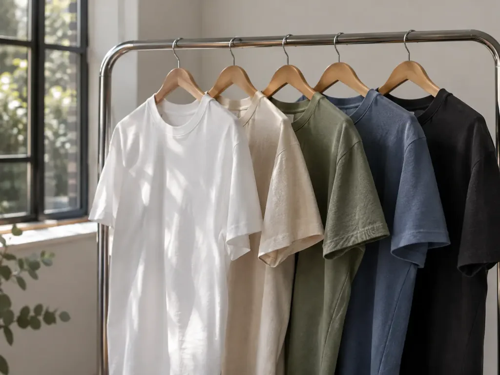
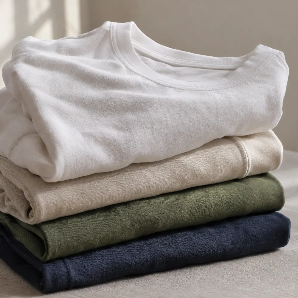
The garment is a free color. A cream design on a forest green tee is two colors visually, but only one ink. Plan your design around the shirt instead of covering it.
Overprint for a third color
Some inks are partly transparent. For example, print blue over yellow and you get green where they overlap, with no extra screen. It takes testing, but it is a classic screen printing move that gives you more color for free.
Use halftones for shading
Halftones turn one ink into many shades using dots of different sizes. As a result, a single black screen can give you light grey, mid grey and solid black. It does need a finer mesh, but we choose that for you.
Merge near-duplicates
However, designs drawn on a computer often contain three slightly different reds. On a shirt, nobody can tell them apart. Merge them into one and save two screens.
How many colors should your design have?
| Colors | Good for | Notes |
|---|---|---|
| 1 | Logos, line art, type, staff shirts | Cheapest and often the boldest |
| 2 to 3 | Most merch and illustrations | The sweet spot for cost and impact |
| 4 to 6 | Detailed illustrations, big runs | Worth it when the run is large |
| Full color photo | Images with many tones | Needs simulated process or a digital method |
For photos on small runs, a digital method can make more sense. Our screen printing vs DTG guide explains when.
Dark shirts and the hidden color
On a black or navy garment, bright colors usually need a white underbase printed first. That white is a real screen, even though you never see it as a color. So a two-color design on a dark shirt can count as three. We always show the underbase on the proof so it never surprises you.
Choosing your screen printing colors
Name your colors precisely. A Pantone reference is ideal; a hex code or a photo of an object in the color you love works too. We mix ink by hand to match and check it under daylight, because shop lights and phone screens both lie. Remember that ink on fabric never looks exactly like light from a screen, especially on colored garments.
An example: from six colors to three
Picture a sunset illustration with a sky in three oranges, a yellow sun, a dark sea and white lettering. On a computer, that is six colors. On a natural tee, we might print it like this:
- Merge the three oranges into one strong orange, with a halftone for the softer sky.
- Then keep the yellow, and overprint a little of it on the orange for a warm middle tone.
- Finally, print the sea and lettering in one dark ink, and let the natural shirt show through as the light.
That is three screens instead of six. The print costs less, registers more cleanly and, in our experience, usually looks more like a real screen print.
When more screen printing colors are worth it
Fewer is not always better. Detailed illustrations with many distinct areas, brand art with strict colors, or a big run where setup barely matters can all justify five or six screens. Still, the rule is simple: every color should earn its screen. If removing a color would make the design weaker, keep it. If nobody would notice, cut it.
Our take
When someone sends us a six-color design for a run of 24, we usually suggest a two- or three-color version first. Most of the time they like it better. After all, it prints cleaner, costs less and looks more like a real screen print.
Designing something new? Read our artwork guide, then send your file through the custom run form. We will suggest the fewest screen printing colors that keep your design strong, and show you both versions on the proof if you want.
Color questions
How many colors can screen printing do?
Many, but every color needs its own screen. Most merch looks best and costs least with one to three colors.
Does the shirt color count as a color?
No. The garment is a free color. Designing around it can make a one-ink print look like two colors.
Why does a dark shirt add a color?
Bright colors on dark garments usually need a white underbase printed first, which is an extra screen.
Can you match my brand color?
Yes. Send a Pantone reference, a hex code or a sample, and we mix the ink by hand to match.